

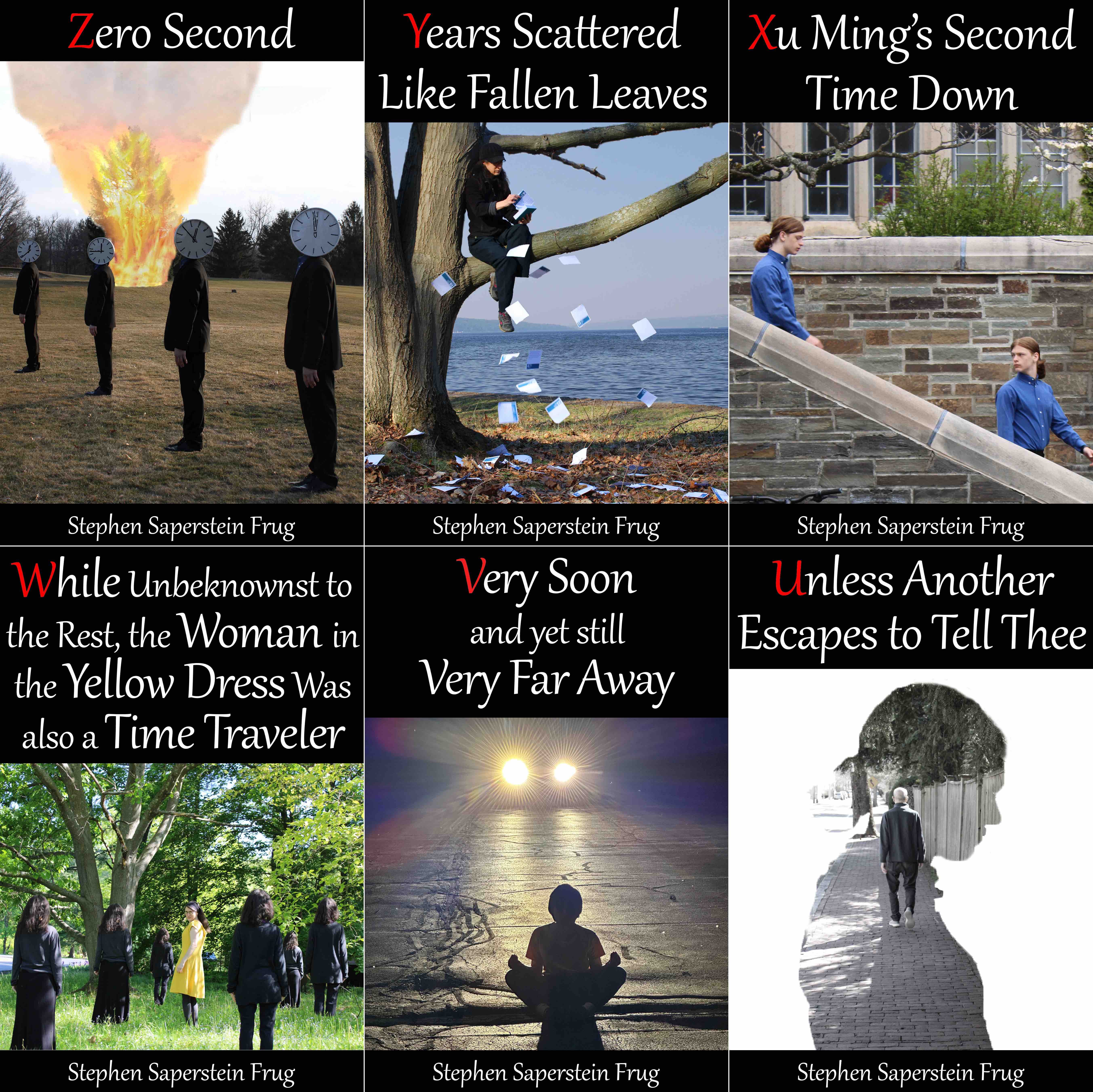
The Covers of Retcon

So as you may have noticed if you’ve been reading these essays and note, I am currently publishing a series of stories which together make up a larger narrative, what I am calling a mosaic story. At the moment, each individual story is being published as an ebook (for $0.99 each); at the appropriate time, I intend to gather the installments of each movement into a single collection (so that the whole becomes a trilogy), and those I hope to have printed as old-fashioned dead-tree books as well.
And, yes, there’s a new one out! Number five. It’s called “Very Soon and Yet Still Very Far Away”. It recenters the series, which has explored a few other areas, to the issue which came up in story one: that of zero second, the time beyond which neither time travelers nor future messages have return. For at the beginning of the story, a traveler returns… from four days after zero second.
If you want to read more, you can now buy the story at my web site, or at Amazon, AmazonUK, Apple Books, Barnes and Noble, Kobo, or Smashwords. You can also buy the entire series in one go at my web site, and I’ll send you stories 1-5 right away, and the remainder as they’re published.
—Ah, but I have wandered off into a commercial. Careless of me. Where was I? Oh yes:1
As I am publishing the stories as separate ebooks, that means that each one of them has to have a cover.
I reasonably quickly decided that this was a feature, not a bug. You see, I like working in the visual arts as well as writing. I don’t think I’m as good at it (although perhaps I am overestimating my writing talent), but I do enjoy it, and think the results are not without worth. And while Retcon, unlike my previous endeavor, is not a story told in images, I am happy to have the occasion to do a touch of visual illustration in the process. I think of the covers as, essentially, a related but not identical artistic project.
So I thought I’d tell you about the covers—at least the five so far. Well, actually, the first six: for I am about to debut, for the first time, the cover to the forthcoming (available August 9!) sixth story as well. This is a worldwide exclusive here, folks. Please enjoy it enough to justify the bribes it took to make it happen.
(Incidentally, as was the case with last week’s post, which was also both long and image-heavy, this one is definitely blowing through the email limit. If you’re reading this on email, and get to a cut-off, just click through to read the rest.)
I have been exploring, in an occasionally-surf-around-the-web-to-see-what-I-can-see sort of way, a type of photography—it’s probably too loose, too assembled-only-in-my-own-head, to call it a genre—that I think of as surrealist photography. It’s not, always: some of it is just, say, photographed from weird angles. But it is photography (unlike, say, most selfies, or portraits, or nature photography, or street photography, or for that matter abstract photography) which creates a sense of the unusual, the uncanny: estrangement in the aesthetic sense. I won’t try to give examples here: it’s too nebulous and ill-defined to suggest briefly, so I will wait until I find time to devote an essay to the topic (which I hope to do).
But I thought that photographs in that general vein would be a good fit for Retcon, which is an SF series, but one set in (roughly) the present day: that is to say, it is part of what critic John Clute calls fantastika, but isn’t set in a strange and unknown landscape. It’s an odd twist on the ordinary world: so I thought the photographs should match.
At the same time, I wasn’t ever planning to use the covers to illustrate the stories in any sort of literal way. None of the covers present a scene in the stories; the people on the covers (who are friends and family who have been kind enough to help me out) are not representing in any specific way the characters in the stories. The images are just supposed to be mysterious and intriguing and visually striking, and rhyming, in some aesthetic sense, with the story inside.
In some ways what I am doing is taking the title of each story, and illustrating that, rather than illustrating the story itself. I have no idea if this makes any sense at all as a procedure, but it’s what I am doing.
I do think that the covers work as a visual set, which, for a series, strikes me as obviously important: the images have a stylistic coherence.
A few notes about each of the covers.
Zero Second

This was, I think, my most successful idea: the one that best represented the sort of photography I have been learning about (in an occasionally-surf-around-the-web-to-see-what-I-can-see sort of way). It is obviously surreal: the figures have clock faces for heads, and the flames which engulfed the tree have not spread to the grass nor the other trees nearby (the tree is by itself in the field, but I have to imagine that a flame that big would spread in reality). And then there is the sheer weirdness of the figures just standing there: that, too, is an important part of the effect, and part of what makes it surreal in the sense I intend with the term. Often the oddity in the photographs I am referring to is simply the oddity of what people are doing. At any rate this is the case in many of the images I am crafting for Retcon.
Procedurally this was a fairly straightforward shot: I simply shot a bunch of images with a camera mounted on a tripod, and then photoshopped them together. The clock faces were, in fact, physically attached to the model’s head (using a string itself attached to the back of the clock with tape). But I decided that, despite my intense commitment to realism, actually setting the tree on fire might be frowned upon by the local authorities, so I lit that fire in photoshop, compositing a number of different public domain images of fire to do so. I have yet to receive the thank-you note from the local fire department for this supreme act of self-sacrifice, although I assume it is in the mail.
Years Scattered Like Fallen Leaves
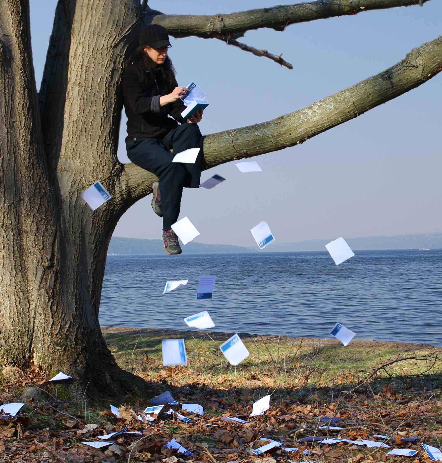
This was a case of a good idea whose execution resulted in an image that might not be as legible as I intended.
The idea is that she is tearing the pages off one of those page-a-day calendars you find on people’s desks (probably less often in the digital age than before), where each page bears a cartoon or fact or trite bit of wisdom. (I simply used the cheapest one I could find.) I think it reads, but honestly I am not sure. If anyone has any feedback on this I’d be interested to hear it, even though it is too late to change it.
The background is a photo I took fifteen years ago while location shooting for my graphic novel. My first draft had the actual background to the tree:
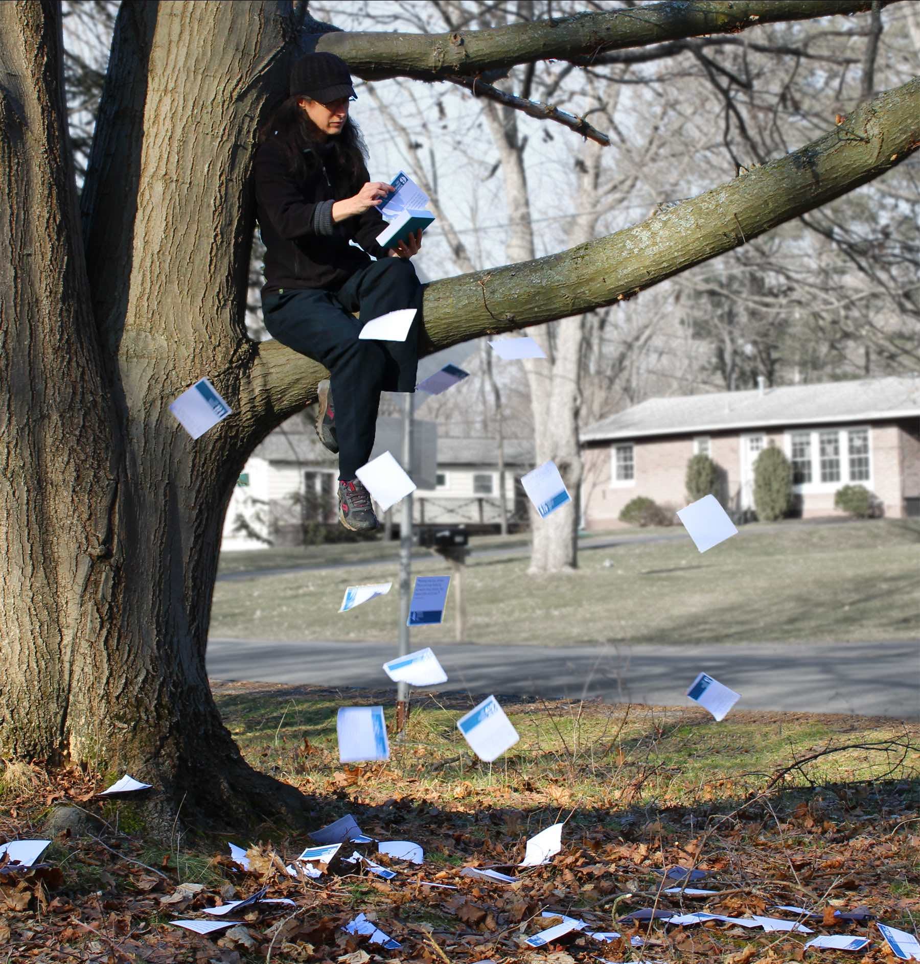
But even with the background muted in various ways, it was simply too busy and didn’t focus the attention where I wanted it, so I decided to put the tree by the lake, which at least in my estimation greatly improved it. Thank God for photoshop!
This is a case where all the surreality comes from the what is she doing?!? question. There’s nothing person-with-a-clock-head weird here, but for the most part women don’t sit in trees and tear off pages of calendars. It’s bizarre. Enough to given the image a feeling of surreality, at least for me.
Xu Ming’s Second Time Down
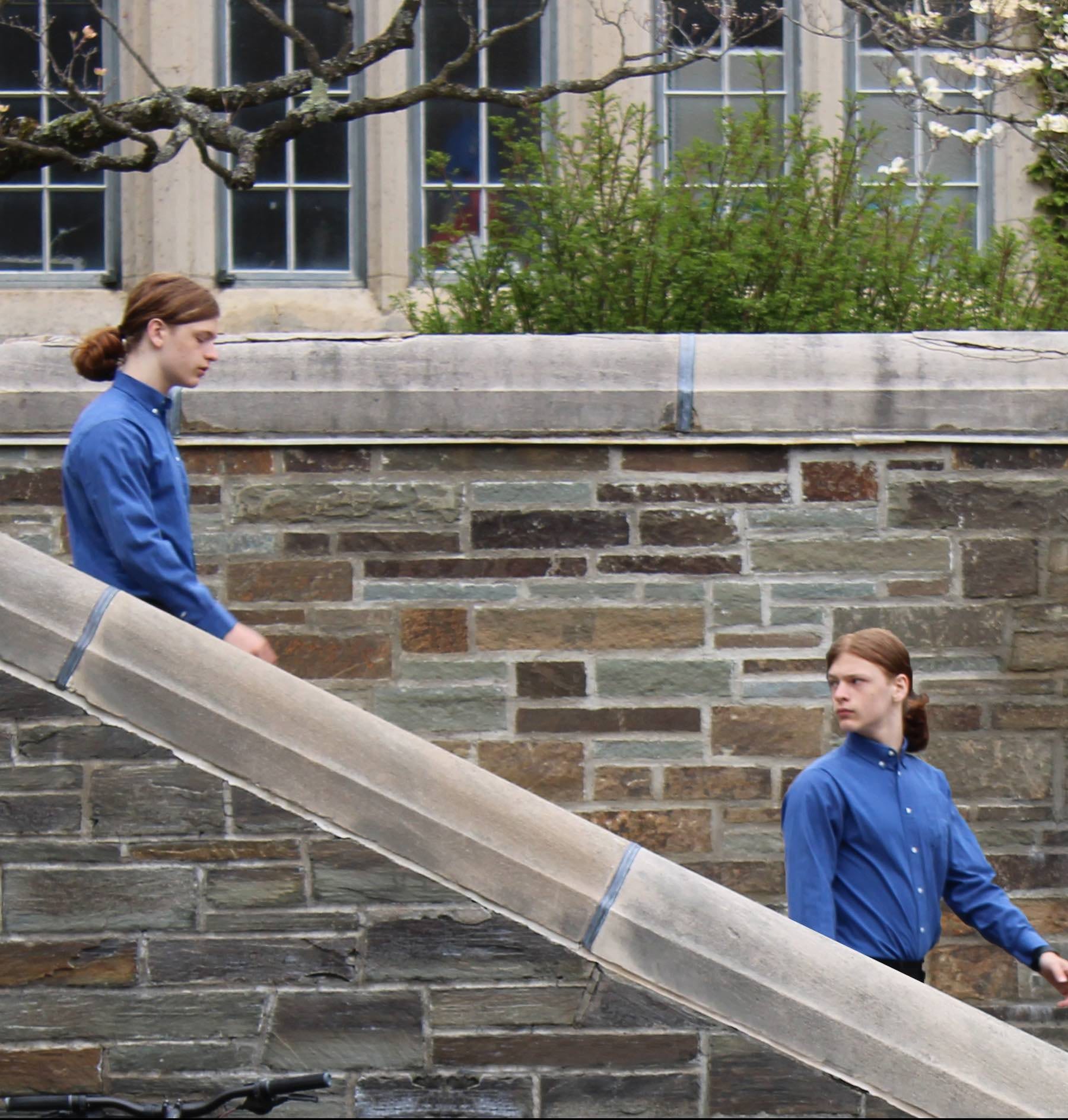
This was a lesson in the importance of redundancy, or perhaps of the necessity of flexibility.
I had planned on a particular location, which turned out to be unusable. So we found another place on the fly, and took a great number of photographs there. In the end, however, that location was all wrong and none of those images were usable. Fortunately, on the way back we happened to spot this staircase, and on the spur of the moment stopped and took a few images at this third location. Those turned out to be the ones I assembled into this cover.
If I had picked this out as the location and taken more photos here, and I would have had more choices, of course, and this could have been a slightly stronger image: one of the two figures in the above photo is slightly softer than I would like. But at cover size it is fine (it’s only if you blow up the image that it’s noticeable). Still, this is another case where the idea is, perhaps, slightly better than the execution.
I do like the idea, though, and like “Zero Second” it is an actually surrealist image, which pleases me.
While Unbeknownst to the Rest the Woman in the Yellow Dress Was Also a Time Traveler
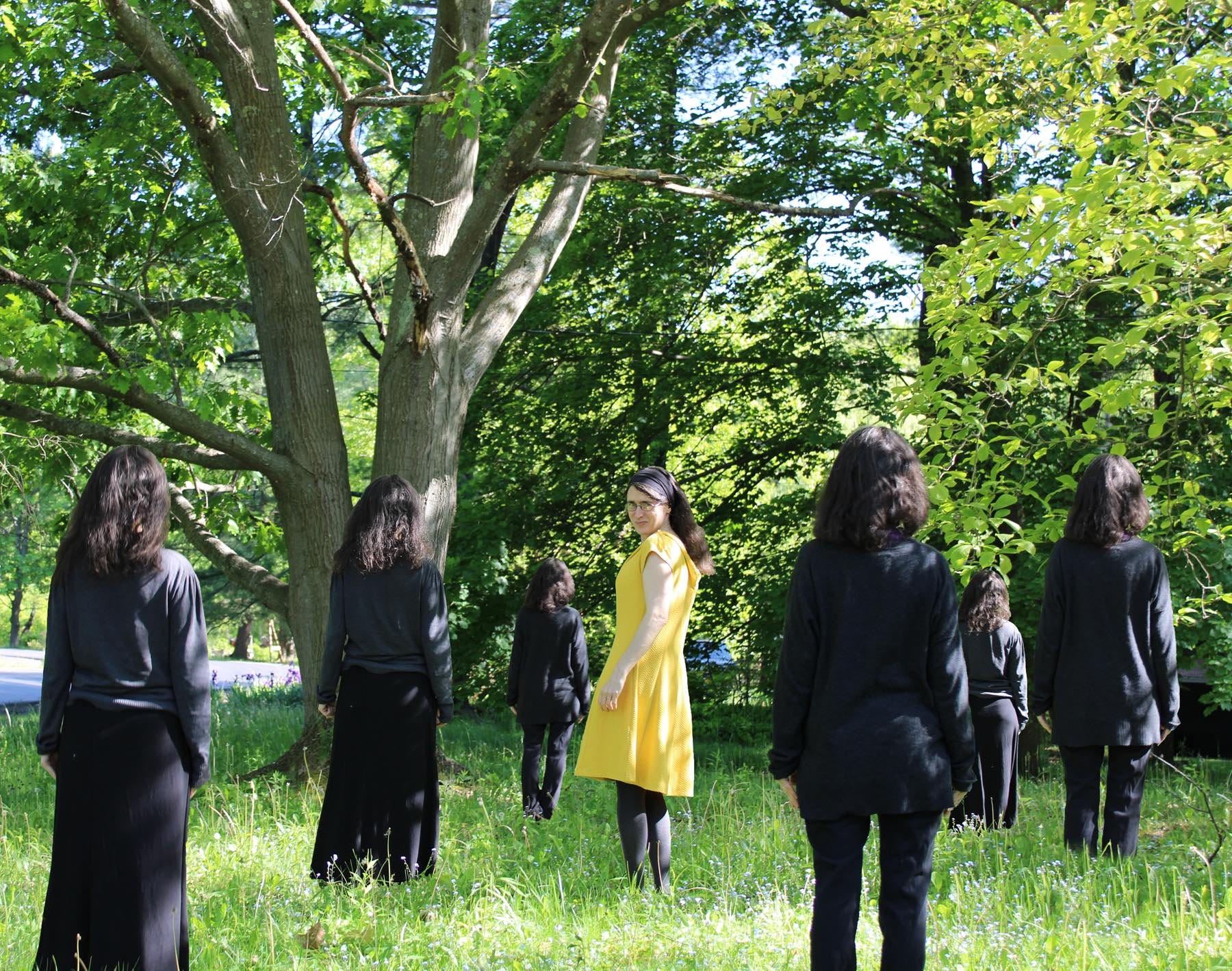
This was my most expensive photo to shoot yet.
You see, it turns out that none of the women I happen to know well enough to cajole them into posing for a cover owned a yellow dress. One had to be purchased specifically for this shoot.
Now, this was done at a thrift store; it wasn’t that much money. But since my working budget for this entire project (as was the case with my previous one) was $0.00, any purchase at all was in some sense a cost overrun. I had found a page-a-day calendar for under $3, but sadly, yellow dresses, even used, are not so cheap.
(My first draft of the story had the additional time traveler in a blue dress. I changed her into a yellow one for very good and important reasons,2 but it would have been easier from a strictly cover-image point of view to have her in blue.)
My initial thought was to place the figures in an empty field—something more like the one I had used for the “Zero Second” cover—but for various logistical reasons it wasn’t possible. On the whole, however, I am perfectly happy with how this image came out.
Very Soon and Yet Still Very Far Away
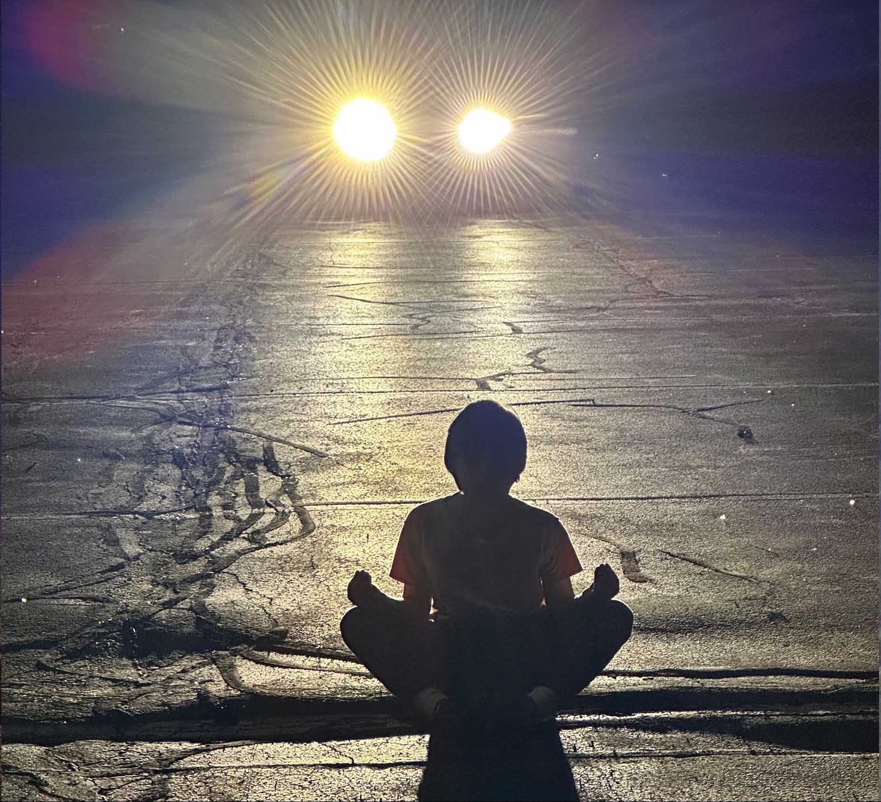
Usually when I take shoots for these images, I end up with a number of different images to chose from. Sometimes the choice is obvious. Often, however, it is not. In this case, I ended up with a number of images I liked, some of which were quite different from each other.
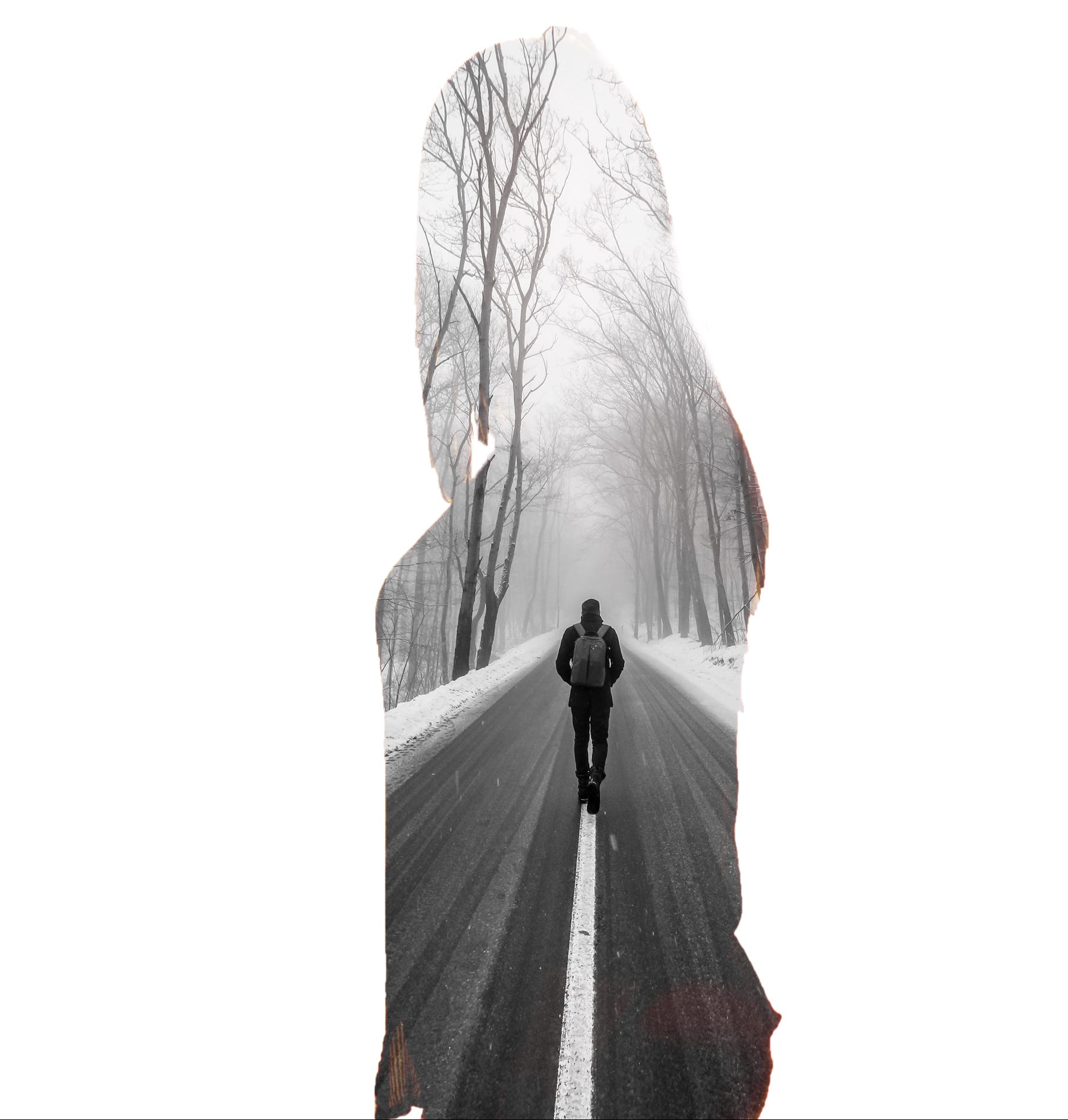
In this case, there was another photograph that I thought was better as a photograph:
…but I thought the image I ended up choosing worked better as a cover. Among other things, the image “read” better: the idea (a boy meditating on a street as a car approached) was more readily legible. So—with a great deal of hesitation—I chose the one I did.
This shoot, incidentally, was badly planned on my part: my camera (my real camera, the SLR, the one for which I had a tripod) had, it turned out, a dead battery and I didn’t have a spare (as I always did back in the old days). So I just pulled out my iPhone and took the shots with that. I was concerned that a night shoot wouldn’t produce any usable images without the tripod, but in fact I was quite happy with how they came out.
This, of course, is another image where the sense of the uncanny arises from what is being done (children do not, as a rule, sit in meditation poses in the middle of streets at night), rather than anything as explicitly surreal as in the first and third covers.
Unless Another Escape to Tell Thee
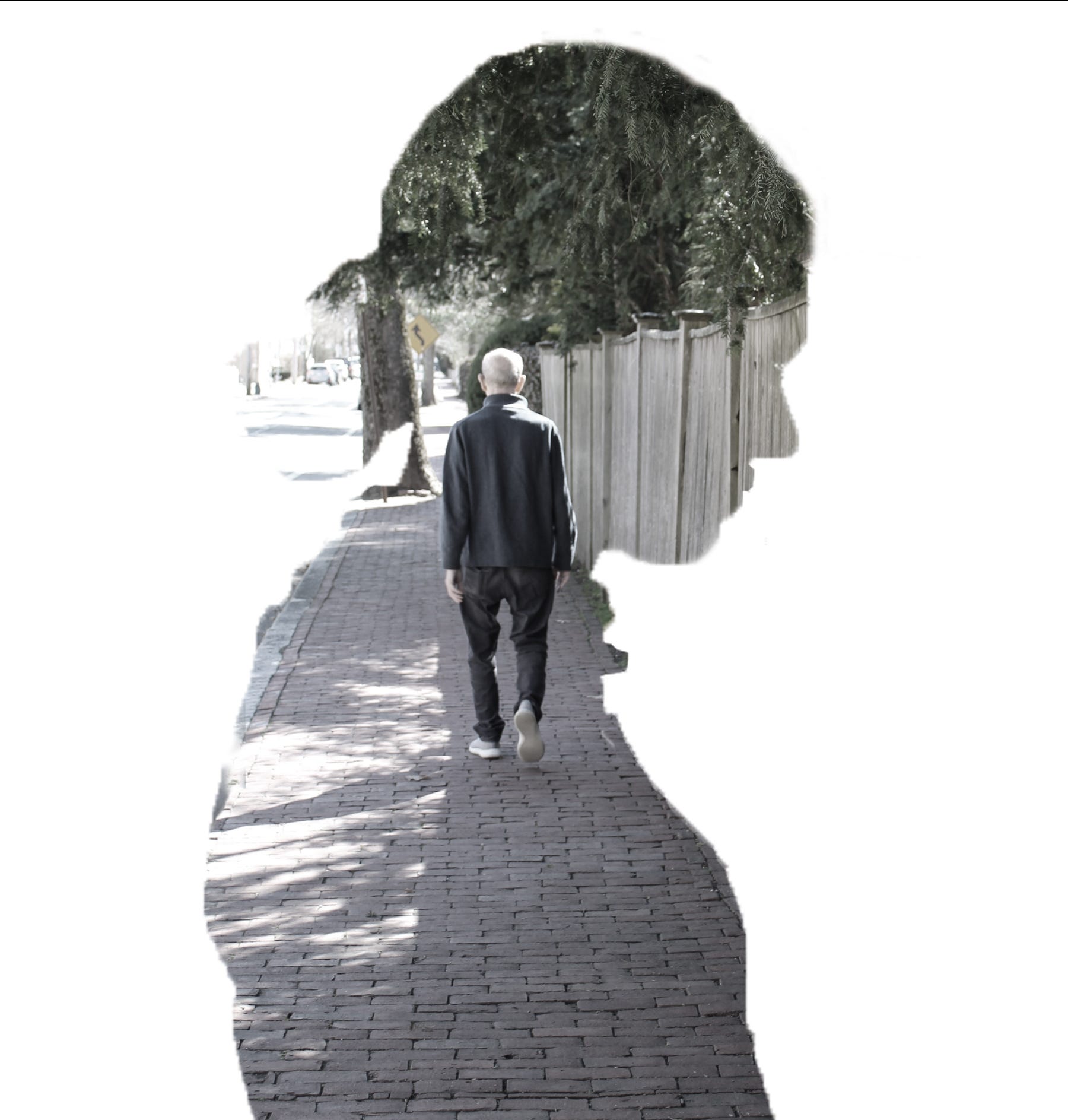
This image is in a preexisting Style: the “using a silhouette to shape another image” picture (there may be a term that laypeople use for it, but that, of course, is its technical name) has been often done before. Two photographers whose work I have enjoyed who use this style are Christoffer Relander and Aneta Ivanova (who made a helpful tutorial on her process); a few of Miriam Tölke’s photographs are also in this neighborhood (e.g. this or this). This style is not exactly surrealistic in the way that most of the images I have been searching out are, but they’re certainly weird, and that seemed close enough: I liked the idea of doing one as part of this series, and this was it. For reasons you will see when you read the story, I think this image is my most successful integration of the theme of the story into the cover image to date.
Incidentally, this is a case3 where I used public domain photos to make a mock-up, to get a sense of what it might look like, before taking my own. This is (one of the) mock-ups I made:
This convinced me to go ahead and shoot my own photos for the cover.
My cover image for this story takes on an extra poignancy for me because my father (who is the gentleman walking away from the camera in the photo I used) fell shortly after this was taken and would not have been able to do the shoot if I had waited. Carpe diem, is what I always say.
I hope you have enjoyed this tour of the Retcon covers to date (and, indeed, slightly into the future). If you liked the images, you’ll love the stories! If you haven’t read them yet (yet have read this far), do check them out. You can get the stories at my personal web site (which also includes an option to purchase the whole series at one go), or at any of the standard ebook stores: Amazon, AmazonUK, Apple Books, Barnes and Noble, Kobo, or Smashwords. You’ll love them! Only $0.99/each! Give it a try!
…Or did I say that already?
If you find your mind automatically leaping from the lines “Where was I? Oh yes—” to the words “the pit of despair”, then we have something in common.

Albeit ones that are probably not evident from the story (but which also couldn’t be explained without spoilers).
Not the only one, but it’s certainly not something I always do.